Pepsi’s Logo Redesign: Nostalgia and a Leap into the Future

How Pepsi’s new logo bridges the gap between the past and the present, capturing the attention of consumers across generations.
For decades, Pepsi has been a ubiquitous presence in popular culture, with its logo making memorable appearances in movies and TV shows. However, as the brand celebrates its 125th anniversary this year, it has decided to embark on a redesign journey to better align with the preferences of today’s consumers. By listening to its customers and embracing its legacy, Pepsi aims to become the choice of a new generation.
The Power of Nostalgia in Branding
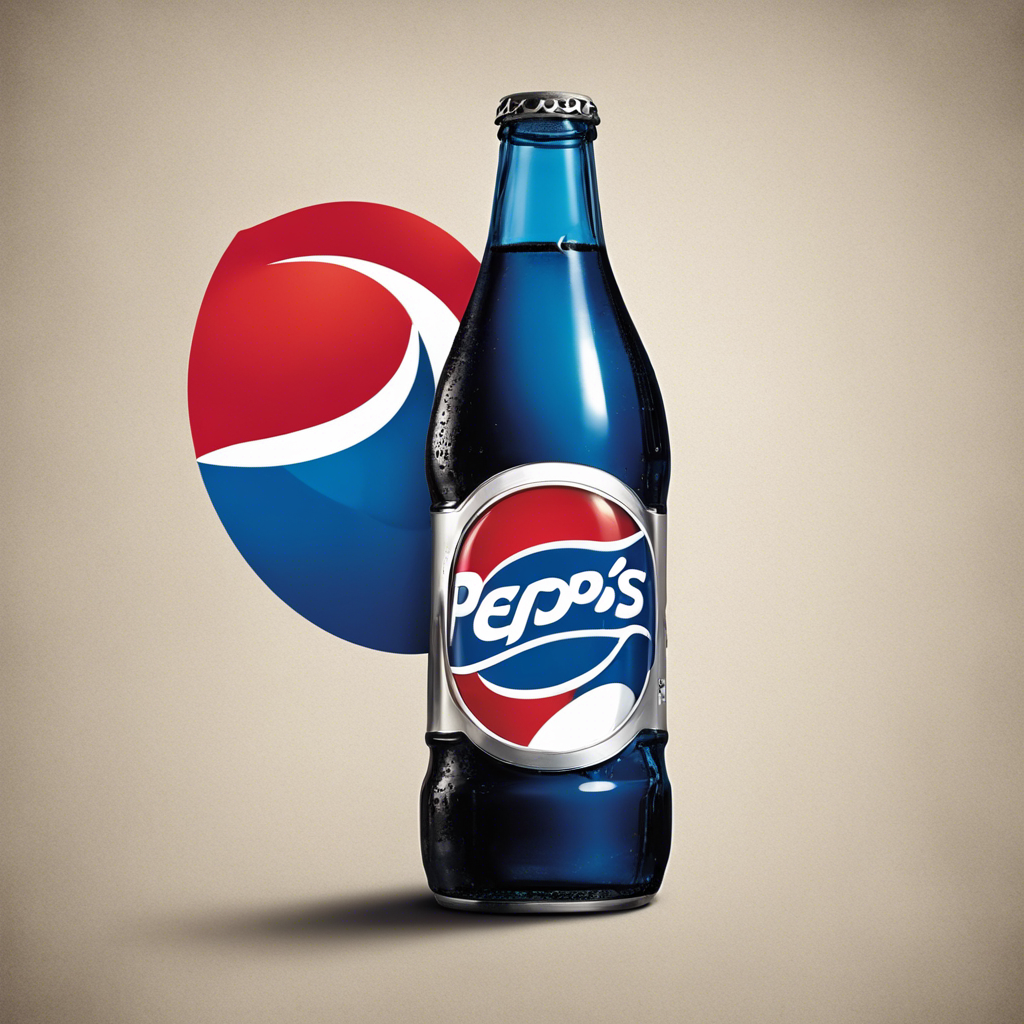
Pepsi’s logo has evolved over the years, but the iconic red and blue globe design from the 1980s and 1990s continues to resonate with viewers. From McCaulay Culkin’s Home Alone to Corey Feldman’s The Goonies, the old Pepsi logo has left an indelible mark on younger generations. Even Gen Z consumers, who were not alive when the logo was in use, associate Pepsi with the vintage design. This nostalgia factor plays a significant role in shaping consumers’ perception of the brand.
A Lesson in Listening to Consumers
Recognizing the need to stay relevant in a rapidly changing market, Pepsi’s consumer, design, and analytics teams spent two years studying consumers of all ages. Through focus groups, virtual evaluations, and eye-tracking technology, they discovered that customers were no longer drawn to the logo that resembled the brand’s past. The complex and unmemorable design from the 2008 redesign failed to capture consumers’ attention. Pepsi realized that it needed a fresh, energetic, and playful logo to resonate with its loyalists.
The Art of Simplicity in Design
In redesigning its logo, Pepsi went back to basics. The new design features bold, all-caps lettering and an angled typeface that signifies modern progress. The brand also reintroduced the Pepsi name within the red and white globe, a nod to its heritage. The addition of black outer circles pays homage to its zero-sugar line. The simplicity of the new logo allows it to stand out on shelves and in digital spaces, ensuring maximum visibility and recognition.
Embracing the Future
Pepsi’s new logo not only captures the essence of its past but also sets the stage for the future. The dynamic animation of the logo in digital form reflects the brand’s forward-looking approach. Additionally, the emphasis on Pepsi Zero Sugar aligns with the growing demand for healthier beverage options. With nearly 15% annual growth in the zero-sugar category, Pepsi aims to cater to consumers who want to enjoy the taste of cola while reducing their sugar and calorie intake.
Conclusion:
Pepsi’s logo redesign is a strategic move that combines nostalgia with a vision for the future. By listening to its customers and understanding the changing preferences of consumers, Pepsi has created a logo that is both familiar and fresh. As the brand celebrates its 125th anniversary, it continues to evolve and adapt, ensuring that it remains a beloved choice for generations to come.


